Task 3
TASK 3: CONVENTIONS: Research the key conventions of current affairs magazines. Consider the design, layout, types of articles. You could use the Big Issue Powerpoint and the Big Issue Cover Guide to help you pick out key conventions.
Basic conventions
Masthead – the masthead is the title block for the magazine, usually this is the most eye-catching convention on a page and has to be distinct
Menu – the list of contents inside the paper
By-line – name of the reporter
Caption – text underneath a image explaining it
Headline - main statement, usually in the largest and boldest font, describing the main story, a banner headline spans the full width of the page
Analysis of magazine covers

The first cover I have chosen to analyse is The Week
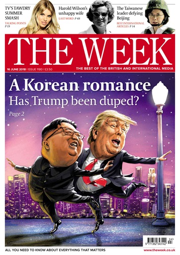
Typically, The Week has a humorous, caricature front cover. This grabs the attention of the audience. This is usually accompanied by a plain, or uncluttered background.
There are always 3 differing images across the top. Here, there is one on reality tv, politics and an international article.
Below this, there is The Week's iconic red and white logo, and underneath that to the right is one of the slogans - 'The best of British and international media.' To the left of this, is the date, issue number and price.
In the bottom right corner, there is a barcode and the website, and in the bottom left, another one of the slogans - 'All you need to know about everything that matters'
 The second cover I have chosen to analyse is The Week Junior, I felt as if this would be a good magazine to make a comparison with, as although it is for young children, it would still allow me to identify the differences of layout and content, and how this would appeal to a younger audience, considering my magazine will be aimed towards a younger audience of 16-25 year olds
 The Week Junior tends to have a very bright, eye catching background cover, with contrasting accents and cut out pictures. This differs to The Week as it usually only has 1 main image. The Week Junior still maintains the iconic red and white colour palate for the logo.
This magazine focuses less on conventions such as bylines, captions and prices, which is understandable as it is irrelevant to them. The current affairs featured are things such as recent movies, wildlife, history and science. There is some focus on politics, but only basic parts of it, such as the election.
The Week has a more spacious cover, whereas The Week Junior is filled with pictures and short amounts of text. Regarding content, The Week Junior focuses more on nature and science - such as animals and space. This would engage a young audience and entertain while still being informative. It is useful that The Week Junior discusses politics as although it is on a basic level, it is useful information that allows children to begin to make sense of the political world and what's going on in their country.
Basic conventions
Masthead – the masthead is the title block for the magazine, usually this is the most eye-catching convention on a page and has to be distinct
Menu – the list of contents inside the paper
By-line – name of the reporter
Caption – text underneath a image explaining it
Headline - main statement, usually in the largest and boldest font, describing the main story, a banner headline spans the full width of the page
Analysis of magazine covers

The first cover I have chosen to analyse is The Week
Typically, The Week has a humorous, caricature front cover. This grabs the attention of the audience. This is usually accompanied by a plain, or uncluttered background.
There are always 3 differing images across the top. Here, there is one on reality tv, politics and an international article.
Below this, there is The Week's iconic red and white logo, and underneath that to the right is one of the slogans - 'The best of British and international media.' To the left of this, is the date, issue number and price.
In the bottom right corner, there is a barcode and the website, and in the bottom left, another one of the slogans - 'All you need to know about everything that matters'
 The second cover I have chosen to analyse is The Week Junior, I felt as if this would be a good magazine to make a comparison with, as although it is for young children, it would still allow me to identify the differences of layout and content, and how this would appeal to a younger audience, considering my magazine will be aimed towards a younger audience of 16-25 year olds
 The Week Junior tends to have a very bright, eye catching background cover, with contrasting accents and cut out pictures. This differs to The Week as it usually only has 1 main image. The Week Junior still maintains the iconic red and white colour palate for the logo.
This magazine focuses less on conventions such as bylines, captions and prices, which is understandable as it is irrelevant to them. The current affairs featured are things such as recent movies, wildlife, history and science. There is some focus on politics, but only basic parts of it, such as the election.
The Week has a more spacious cover, whereas The Week Junior is filled with pictures and short amounts of text. Regarding content, The Week Junior focuses more on nature and science - such as animals and space. This would engage a young audience and entertain while still being informative. It is useful that The Week Junior discusses politics as although it is on a basic level, it is useful information that allows children to begin to make sense of the political world and what's going on in their country.


Comments
Post a Comment